Project: K.N.S. AddressBook
K.N.S. AddressBook is a Java desktop address book application created by Team W11-B3 during the course of CS2103T Software Engineering in AY2017/8 Semester 1. This portfolio page will show you the contributions I have made to our project.
Code Contributed: [Functional Code] [Test Code]
Enhancement Added: Avatar
External behavior
Avatar is the contact’s display picture that can be found in the Person Panel. When using the add or edit command,
you can change the Avatar by entering a valid URL or file path on the computer. If no URL or file path is provided,
a default placeholder Avatar is created.
Alternatively, clicking on the display picture in Person Panel will bring up a GUI upload window for users to specify
a picture to be used in their computer.
Justification
It is important to know what your contact looks like, especially so if you do not meet him/her frequently. Also, most freelancers have many clients to keep up with; it is likely that they may forget how their client looks like over time.
The alternative way of editing the Avatar is useful for users who are unsure as to how to get the actual file path of
the image found in their computer. Also, the file path may be very long, and this will cause the command box to be
overfilled with text (causing parts of the text to be hidden). This can be frustrating for users who would want to
check whether they have entered the correct details in the add or edit command.
Avatar
The Avatar class is a new contact detail that displays a display picture obtained
via a valid Uniform Resource Locator (URL) or a local directory path in your computer.
If no display picture is assigned to the contact, then creates a default placeholder image.
In order for the user to upload an Avatar for the contact, he/she can use the Add/Edit command or Graphical
User Interface (GUI) upload (AvatarWindow) to do so.
Java Implementation: Avatar
The display and storage of Avatar can be seen in the following code snippets:
public Avatar() {
    AvatarUtil placeholder = new AvatarUtil();
    image = placeholder.getPlaceholderAvatar();
    value = DEFAULT_VALUE;
}
Code Snippet 1 (Avatar()): The default constructor for Avatar is used when no display
picture is assigned to a newly added contact. The default placeholder Avatar is generated
with the dependant class AvatarUtil.
public Avatar(String url) throws IllegalValueException {
    try {
        if (url.isEmpty() || DEFAULT_VALUE.equals(url)) {
            AvatarUtil placeholder = new AvatarUtil();
            image = placeholder.getPlaceholderAvatar();
            value = DEFAULT_VALUE;
        } else {
            File defaultAvatar = new File(url);

            if (isValidUrl(url)) {
                this.url = new URL(url);
            } else {
                this.url = defaultAvatar.toURI().toURL();
            }
            this.image = ImageIO.read(this.url);
                        // Code Continued in Snippet 2B
Code Snippet 2A (Avatar(String url)): If a URL or local directory path string is provided,
then the parameterized constructor will check if the provided string is valid or not. If the string
is valid (i.e. non-empty and existing), then it will parse the URL and read the image given.
            if (!isSavedInData(url)) {
                String outputName = "/data/" + this.image.hashCode() + ".png";
                File outputImage = new File(System.getProperty("user.dir") + outputName);

                File parentDirectory = outputImage.getParentFile();
                if (!parentDirectory.exists()) {
                    parentDirectory.mkdirs();
                }

                ImageIO.write(this.image, "png", outputImage);
                this.url = outputImage.toURI().toURL();
            }
            this.value = this.url.toString();
        }
    } catch (Exception e) {
        throw new IllegalValueException(MESSAGE_AVATAR_CONSTRAINTS);
    }
}
Code Snippet 2B (Avatar(String url)): If the image given has not yet been stored in the data
directory, it will generate a new file and save it.
To better illustrate the code snippets, here is a sequence diagram when a user changes a person’s avatar with a new image (that is not currently stored in the data folder):
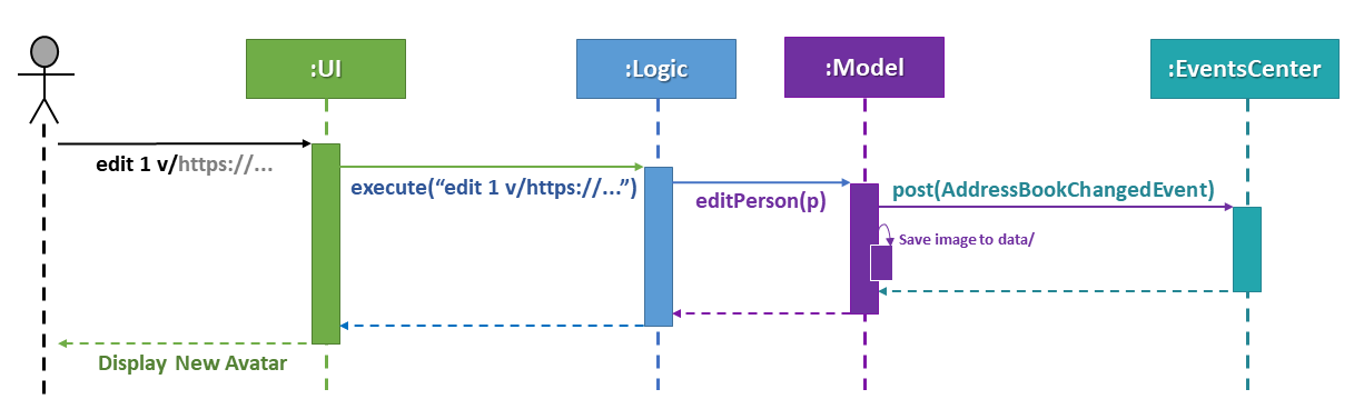
Figure 5.3.1.1: Sequence Diagram for Changing Avatar
Changing the Avatar of a contact will result in an immediate display change to the user.
|
Dependant Class: AvatarUtil
AvatarUtil generates a default placeholder image if the contact is not given a display picture. It relies
on the java.awt library to generate a picture drawn by the methods found in Graphics2D and Color.
You can find the full implementation of AvatarUtil in the folder java/seedu/address/commons/util.
|
Dependant Class: AvatarWindow
AvatarWindow is a UI component and is triggered when the current avatar of a contact is clicked on as such:
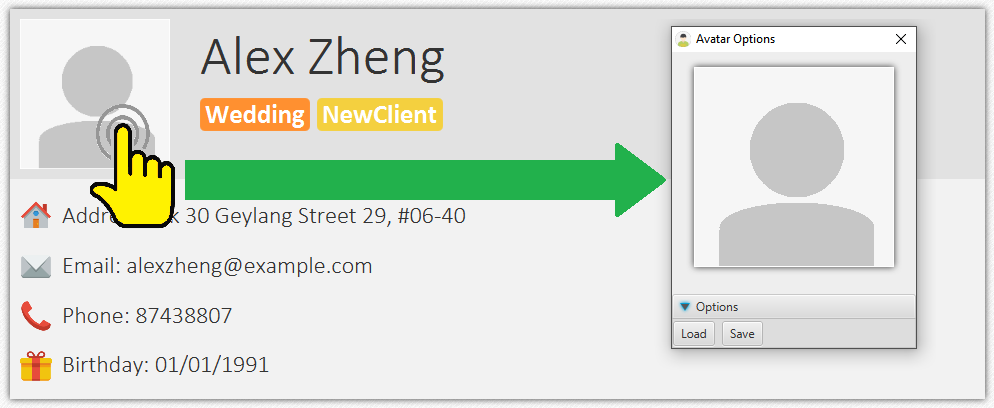
Figure 5.3.3.1: Avatar Window Pop-up
A window will appear for the user to load and save a picture from the computer. If a valid picture is loaded and saved,
it will create an Edit command and raise a new event; this event is the same as typing an actual valid edit command,
and can also be undone or redone as per normal.
You can find the full implementation of AvatarWindow in the folder java/seedu/address/ui.
|
Design Considerations
Aspect: Additional ways of changing Avatar.
Alternative 1: Only allow user to use the Add and Edit commands to change the Avatar of the contact.
Pros: No time is spent to make new ways of changing Avatar.
Cons: May be stifling for users who want to have a GUI option.
Alternative 2 (current choice): Create a GUI alternative for users to change the Avatar of the contact.
Pros: Makes the application more user friendly; easier for users to point and click instead of copying the
picture’s directory path, which may take a longer time.
Cons: Some classes (e.g. PersonCard, PersonPanel, etc.) have to be modified in order to implement this option.
Aspect: Saving of pictures.
Alternative 1: Save the pictures within the .jar file.
Pros: Users will not be able to modify the pictures downloaded; lesser chances of error exceptions occuring due
to missing files.
Cons: May be inconvenient for a user who would want to manipulate these pictures directly for any purpose.
Alternative 2 (current choice): Save the pictures outside of the .jar file, inside the data/ folder.
Pros: Users will be able to directly access downloaded pictures and manipulate them as they please.
Cons: If users are not careful (e.g. permanently.delete a picture by mistake), the contact’s avatar may get
replaced by the default placeholder.
End of Extract
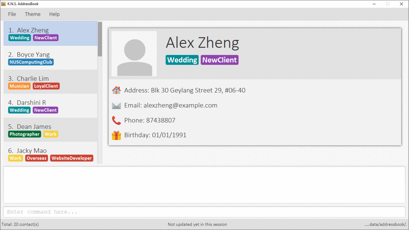
Person Panel
This is where you will find a selected contact’s information (name, address, phone number, etc.) displayed neatly on a single page. When you click on the currently displayed Avatar of the contact, a new window will pop-up like so:
When you click load, you will be given the option to select an image (either in .JPG or .PNG format) stored on
your computer. Afterwards, clicking save will let you replace the current Avatar of the contact.
End of Extract
Justification
Previously, the Person Card was the only thing that showed all the details of a contact. It was too small to fit all
of the text. Aesthetically, this is not good because information should not be crammed into a small area. Thus, I
created a Person Panel which shows all the contact’s details in one page in order to improve aesthetic design and
readability.
Person Panel
The PersonPanel replaces the previous BrowserPanel, and is a crucial part of MainWindow. It is an event-driven
component that displays contact information depending on the user’s actions
Java Implementation
By taking advantage of the java.util.logging package, PersonPanel is able to display all of the details of a contact
(name, address, email, contact number, birthday, avatar, tags) selected in PersonCard. This implementation can be
seen from the following 2 code snippets:
@Subscribe
private void handlePersonPanelSelectionChangedEvent(PersonPanelSelectionChangedEvent event) {
    loadBlankPersonPage();
    logger.info(LogsCenter.getEventHandlingLogMessage(event));
    selectedPersonCard = event.getNewSelection();
    selectedPerson = selectedPersonCard.person;
    isBlankPage = false;
    loadPersonPage();
}
Code Snippet 1 (handlePersonPanelSelectionChangedEvent()): Whenever a contact is selected, an event will be
triggered. The method will respond to the event by obtaining a PersonCard variable and ReadOnlyPerson variable
(which contains all the details of the contact), and pass it into loadPersonPage().
private void loadPersonPage() {
    name.setText(selectedPerson.getName().fullName);
    phone.setText("Phone: " + selectedPerson.getPhone().toString());
    address.setText("Address: " + selectedPerson.getAddress().toString());
    email.setText("Email: " + selectedPerson.getEmail().toString());
    birthday.setText("Birthday: " + selectedPerson.getBirthday().toString());
    avatar.setImage(SwingFXUtils.toFXImage(selectedPerson.getAvatar().getImage(), null));
    selectedPerson.getTags().forEach(tag -> {
        Label tagLabel = new Label(tag.tagName);
        tagLabel.setStyle("-fx-background-color: " + tag.tagColour);
        tags.getChildren().add(tagLabel);
    });
}
Code Snippet 2 (loadPersonPage()): The ReadOnlyPerson variable passed into loadPersonPage can then be used to
extract the contact’s details for display; the UI will be updated accordingly to reflect these changes.
| Upon opening the application, no contact details will be displayed since no contact has been selected yet. |
To better illustrate the code snippets, let us look at the following sequence diagram when a user selects a contact
found in PersonListPanel:
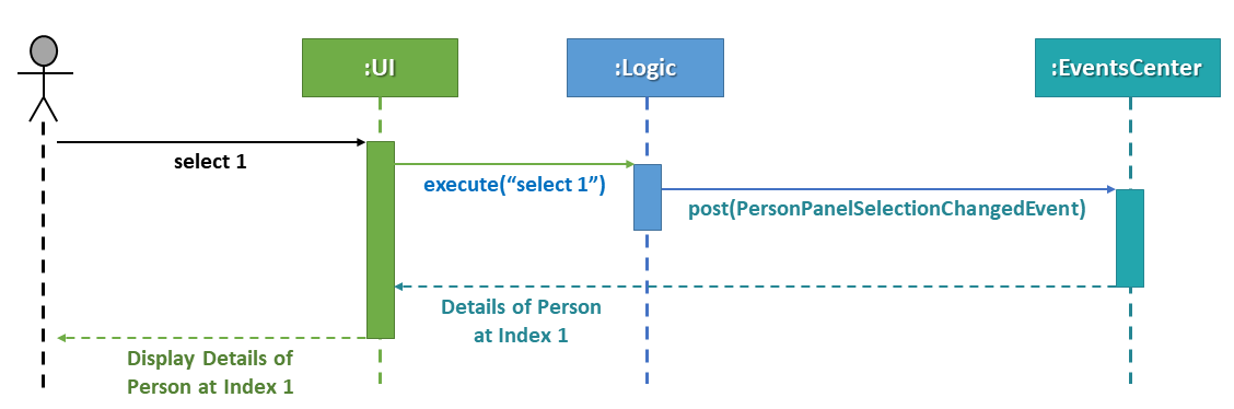
Figure 5.2.1.1: Sequence Diagram for Selection
When a contact in PersonListPanel is selected via command or mouse click, this will result in the EventsCenter
returning a ReadOnlyPerson of the selected contact for display in the PersonPanel.
Layout Implementation
The layout for PersonPanel is specified in PersonPanel.fxml. Visually, it can be broken down into 2 parts as shown:
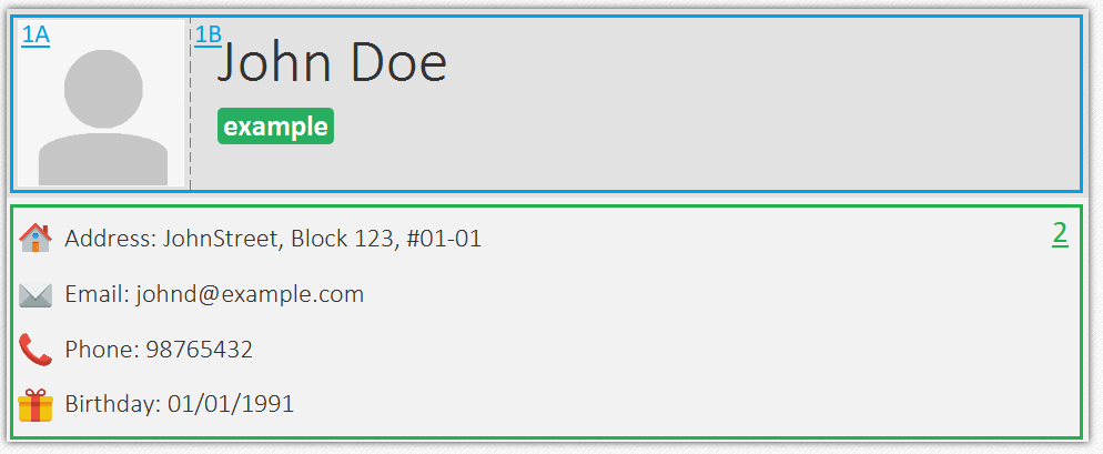
Figure 5.2.2.1: Visual Breakdown of PersonPanel
Part 1 (primaryDetails): This is subdivided into parts A and B. Part A contains the avatar picture of the contact.
Clicking on the avatar picture will cause a new AvatarWindow to be generated, which allows users to change the current
avatar picture of the selected contact. More information about the implementation of Avatar can be found in the next section.
Part B contains the Name and Tags of the contact, which we found to be important in recognising a displayed contact quickly. Hence, they are in a larger font in order to stand out.
Part 2 (secondaryDetails): This displays the Address, Email, Contact Number and Birthday of the contact. As these details are less important than the Name and Tags, they are placed below and are in a smaller font. At the moment, this section appears simple but empty. We plan to implement more features for v2.0, such as a "Notes about Contact" and "Birthday Countdown".
Design Considerations
Aspect: Display of Contact’s Details.
Alternative 1 (current choice): Replace BrowserPanel with PersonPanel, which displays all of the contacts details.
Remove all details but Name and Tags from PersonCard.
Pros: We can build upon PersonPanel and add more features to it, that the BrowserPanel could not achieve.
Cons: PersonPanel will not be able to display personal web pages (e.g. Contact’s Social Media page).
Alternative 2: Keep BrowserPanel and use HTML files to display contact details instead.
Pros: No need to modify existing code; instead just figure out a way to edit and display HTML files that show the
contact’s details.
Cons: May take too long to implement since we are not familiar with how we can do so.
Aspect: Display of Tags In PersonPanel (and PersonCard).
Alternative 1 (current choice): Randomly colourise tags to make them distinct.
Pros: Quick to implement and makes it easier for user to differentiate between tags.
Cons: Tags are always changing colour for each new instance of the application; may seem confusing.
Alternative 2: Keep the previous blue colour for all tags.
Pros: Consistent and simple; no work is needed to be done.
Cons: Takes users a longer time to differentiate between tags.
Aspect: Addition of Icons for secondaryDetails.
Alternative 1 (current choice): Place icons on the left of each contact detail.
Pros: Quick to implement and makes it easier for user to differentiate between each contact detail. Icons can be
easily taken from Google’s Material Design (or any other design website).
Cons: If we were to include more contact details (e.g. social media links) in the future, then we would have to
keep adding more icons; relevant icons may not be found on Google’s Material Design.
Alternative 2: Use different colours for each contact detail.
Pros: Even more quick to implement since it only involves CSS changes.
Cons: Bad idea design-wise because it violates the Triadic Colour Scheme. It could make
the application look less professional and unattractive.
End of Extract
Theme Switcher
When you click on 'Theme' in the Menu Bar, you should see 5 preset themes that you can choose for K.N.S. AddressBook:
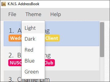
Alternatively, you can use the theme command to change the current display theme of K.N.S. AddressBook.
|
When running K.N.S. AddressBook for the first time, the Light theme is the default appearance setting. Clicking on any
of the other 4 preset themes will result in an immediate appearance change; hopefully one of these preset themes is to
your liking! Here is what K.N.S. AddressBook look’s like in all 5 preset themes:
End of Extract
Start of Extract [from: User Guide]
Changing Themes: theme
You can choose from 5 preset themes to change into: Light, Dark, Red, Blue, and Green.
| The theme names are not case-sensitive! |
Format: theme COLOUR or t COLOUR
Examples:
-
theme Dark -
theme RED -
t blue -
t GrEeN
End of Extract
Justification
Previously, there was only the dark theme in place for the application. We felt that some of the users may not like this default colour scheme, and may not like that they cannot personalise the application’s appearance to their liking. Thus, in order to make the application more attractive visually, we have decided to add more themes for users to choose from. It is important for users to have more choices in how their address book looks like, because it gives them a sense of ownership and allows them to express themselves in someway.
Theme Switcher
The Theme Switcher allows users to change the appearance of the application via the command theme or the drop-down
selection in the MenuBar. There are 5 themes for users to choose from: Light, Dark, Red, Blue, and Green. Here is what
the application looks like in each theme:
Figure 5.10.1: All 5 Themes of the Application
Java Implementation
The Theme Switcher mainly spans over the Logic and UI components.
@Override
public CommandResult execute() throws CommandException {
    if (!isValidTheme(this.theme)) {
        throw new CommandException(Messages.MESSAGE_INVALID_THEME);
    }
    if ((MainWindow.getCurrentTheme()).contains(this.theme)) {
        throw new CommandException("Theme is already set to " + this.theme + "!");
    }
    EventsCenter.getInstance().post(new ChangeThemeRequestEvent(this.theme));
    return new CommandResult(String.format(MESSAGE_THEME_SUCCESS, this.theme));
}
Code Snippet 1A (execute()): When the theme command is executed, it checks for two conditions:
-
Theme Validity → It checks the input arguments for the 5 preset themes. If an invalid theme is given, then a
CommandExceptionis thrown to inform the user that their input theme does not exist. -
Current Theme Displayed → In order to prevent the user from setting the current theme to the same exact theme, it checks whether the valid argument is currently the displayed theme. If it is, then a
CommandExceptionis thrown to inform the user of their error.
If the two conditions are fulfilled, then the theme command will generate a new ChangeThemeRequestEvent for
MainWindow to accept, and return a successful CommandResult.
@Subscribe
public void handleChangeThemeRequestEvent(ChangeThemeRequestEvent event) throws CommandException, ParseException {
    logger.info(LogsCenter.getEventHandlingLogMessage(event));
    mainWindow.getStylesheets().remove(currentTheme);
    prefs.setAddressBookTheme(event.theme + "Theme.css");
    currentTheme = "view/" + prefs.getAddressBookTheme();
    mainWindow.getStylesheets().add(currentTheme);
}
Code Snippet 1B (handleChangeThemeRequestEvent(ChangeThemeRequestEvent event)): The event generated by the
theme command is received in MainWindow. It takes removes the CSS for the current theme, and replaces it with the
input theme’s CSS. The change in appearance is reflected immediately.
To better illustrate code snippets 1A and 1B, the following sequence diagram demonstrates a user entering a valid theme command input:
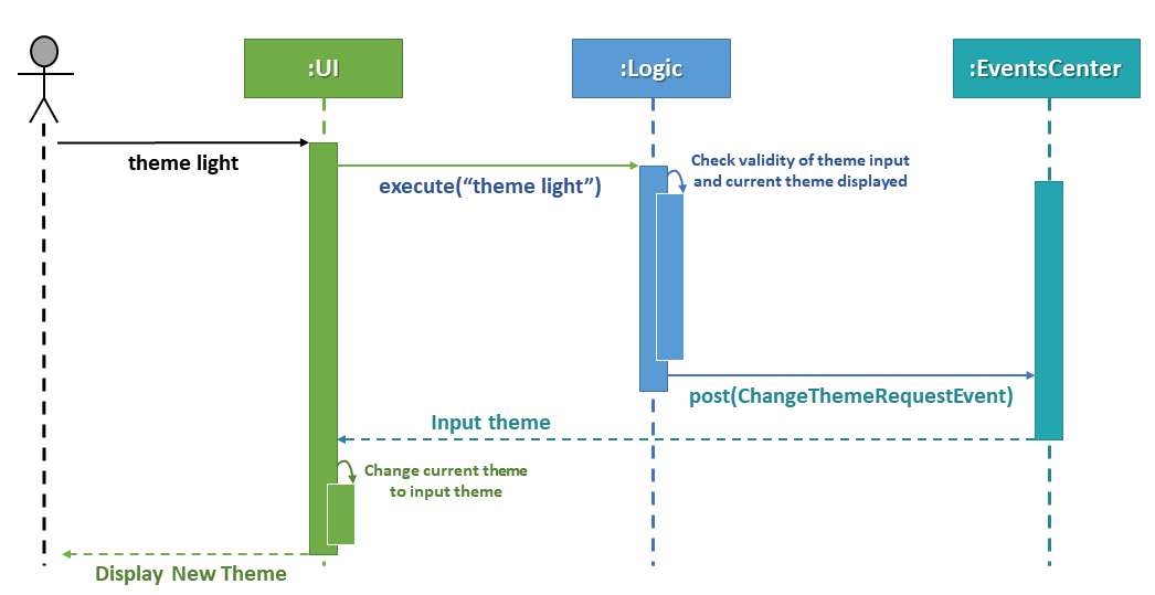
Figure 5.10.1.1: Sequence Diagram for Valid Theme Command
MainWindow does not need to check for the theme validity or whether the same theme is being set, because the theme
command has already accounted for these conditions.
|
@FXML
private void setToVALIDTheme() {
    if (checkSameTheme("VALID")) {
        return;
    }
    mainWindow.getStylesheets().remove(currentTheme);
    prefs.setAddressBookTheme("VALIDTheme.css");
    currentTheme = "view/" + prefs.getAddressBookTheme();
    mainWindow.getStylesheets().add(currentTheme);
    EventsCenter.getInstance().post(new ChangeThemeRequestEvent("VALID"));
    raise(new NewResultAvailableEvent("Theme updated to: VALID", false));
}
Code Snippet 2 (setToVALIDTheme()): Where "VALID" is Light, Dark, Red, Blue or Green. If the user uses the
MenuBar to change the current theme, then it will call the appropriate method to change the current theme to it. Also,
the method ensures that if the user selects the theme that is already being displayed, it will raise a
NewResultAvailableEvent to inform the user of their error.
MainWindow needs to check whether the same theme is being set since no theme command is being executed.
|
Design Considerations
Aspect: Providing a GUI option for switching themes
Alternative 1 (current choice): Provide a GUI option via the MenuBar.
Pros: Simple to implement and users can change themes seamlessly.
Cons: Users will not know what the colour scheme of the theme looks like unless they change to it.
Alternative 2: Provide a GUI option via coloured buttons.
Pros: Users will be able to see the colour scheme of the theme before changing to it.
Cons: Users may get confused as to what these buttons are for.
End of Extract
Enhancement Proposed: Notes For Contacts
Justification
The current version of K.N.S. AddressBook only displays the predetermined details of a contact. It would be useful for a freelancer to be able to note down other miscellaneous details about their clients within the application, so that they do not have to save these details elsewhere. For example, a freelancer may want to note down information about when and where they are meeting their client the next time.
Enhancement Proposed: Birthday Countdown & Reminders
Justification
With the inclusion of a birthday field (implemented by Nadhira), it would be useful to the user if the AddressBook can inform him/her of a contact’s upcoming birthday. To a freelancer, this can be very important because he/she would want to make themselves appear professional and thoughtful by wishing their clients happy birthday.